-
Value messaging here. Looking to educate my potential clients to raise their standards around their personal brand images. I’m imagining a series of seven posts. I want readers to walk away asking, does my brand image attract attention?
Seven jobs your personal brand images should be doing for you – #1 Capture Attention
Coaches, Consultants, Authors, Entrepreneurs, Transformational Leaders,
You’ve got your headshot up on your website, and it’s a reasonably professional and attractive representation of you. But is it doing all it could to promote your business and attract right-fit clients?The first job your personal brand images need to do is to capture attention. The internet is crowded with faces competing for my attention. A creative, vivid image of you can stop the scroll long enough to take a look at what you have to offer.
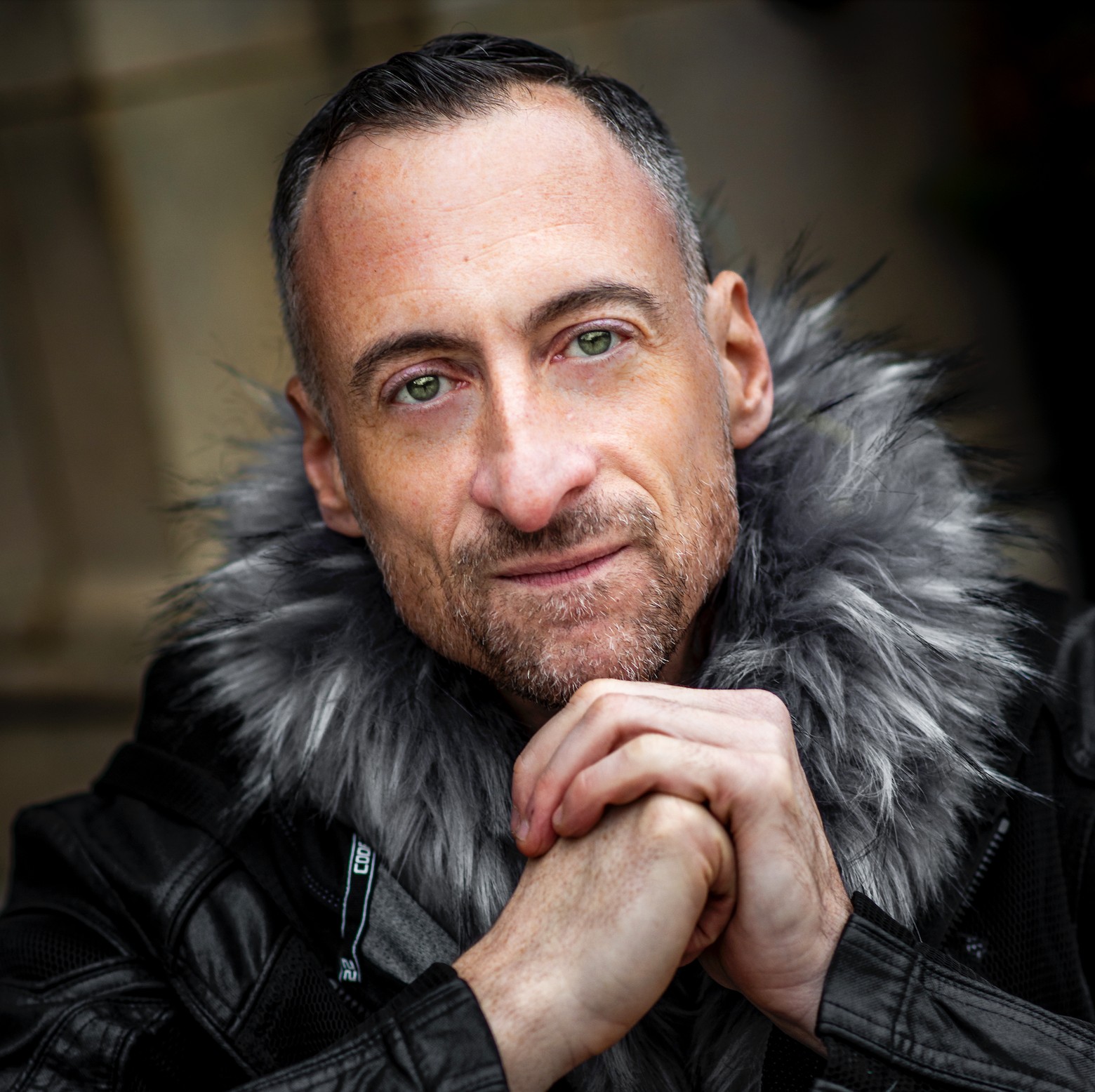
Here’s an image of Matt, marketing consultant who also does styling, lighting, and photography for glam rock acts. Matt’s image is arresting for two reasons:
1. The direct, unapologetic gaze of those green eyes. They stop me cold every time I look at this image.
2. The idiosyncratic 360 degree fur collar. What’s his story? I’m curious about him.
In addition, Matt’s clasped hands also add a deeper, reflective quality to him . Again, what’s his story? I feel there’s more to him than meets the eye.
Obviously, this is not a run-of-the-mill business headshot. This guy has something going on I may want to connect with.
A note on social media profile pics
I just did a search for business coaches on Linked In. I get a screen with face after face in the the standard 400 x 400 circle (but actually sized smaller on search results pages.) Most look exactly the same. Like a high school yearbook. My eyes glaze over.But occasionally a photo pops. The few that draw my eye use one or more of the following strategies:
High contrast between ones face and the background (light face on a dark background or dark face on a light background)
A pop of vivid color – either clothing or in the background
Unusual composition within the circular frame that disrupts the typical head and shoulders lollipopTake a look at your Linked In, Facebook, or other social media profile picture. Does it catch your attention?
Job #1 for your personal brand photos is to get my attention.
Here’s a preview of what your personal brand images should be doing for you I’ll explore in upcoming posts:
1. Capture attention amongst a sea of online faces
2. Create an emotional connection
3. Express your unique way of being present with your clients
4. Establish your professional authority
5. Radiate your approachability and empathy
6. Build anticipation of new possibilities
7. Inspire action to contact youAre you a coach, consultant or transformational leader committed to growing your online authority?
Schedule a complimentary inspiration session
https://calendly.com/badassity/consultation-
-
you are cramming too much. Focus on Matt.
Use this as a brand new post (Or better yet, GO LIVE and talk through this!):
A note on social media profile pics
I just did a search for business coaches on Linked In. I get a screen with face after face in the the standard 400 x 400 circle (but actually sized smaller on search results pages.) Most look exactly the same. Like a high school yearbook. My eyes glaze over.But occasionally a photo pops. The few that draw my eye use one or more of the following strategies:
High contrast between ones face and the background (light face on a dark background or dark face on a light background)
A pop of vivid color – either clothing or in the background
Unusual composition within the circular frame that disrupts the typical head and shoulders lollipop-
Thanks, @amymshannonhernandez-com!
-
-
About Me

Dan Lewis
Photographer/ Personal Brand Consultant
Media
Photos
Videos
Audios
Files


Hey Dan. Love this post… had me thinking about my own headshot!! A couple of things… This line: This guy has something going on I may want to connect with. I’d love to see this changed to “…i want to connect with. This line had me stop wondering if this was part of the post or a commentary for our group… “A note on social media profile pics”… I wonder if you changed the wording “Here’s a quick reveiw of some social media pics I did”- I think “reveiw” positions you an an expert.